Configurator – Administration
There are two administration interfaces in msg.Variant CoFE. “Global administration” and “Material administration”.
The user opens “Global administration” using the button  at the top right in the header on the initial screen. “Global administration” is, as its name implies, global. This means that these settings apply to all users. With these settings, the header, the pictures 1–3 on the initial screen, the display variant of the characteristics and the categories are controlled.

Initial Screen “Global administration”
Unlike “Global administration”, “Material administration” can be set for each configurable material (KMAT). This can be selected after accessing the configurable material. You can do this using the button  at the top right in the header or via the “Global administration” in material section using the button
  .
.

Initial Screen “Material administration”

Initial Screen “Material administration”
Global Administration
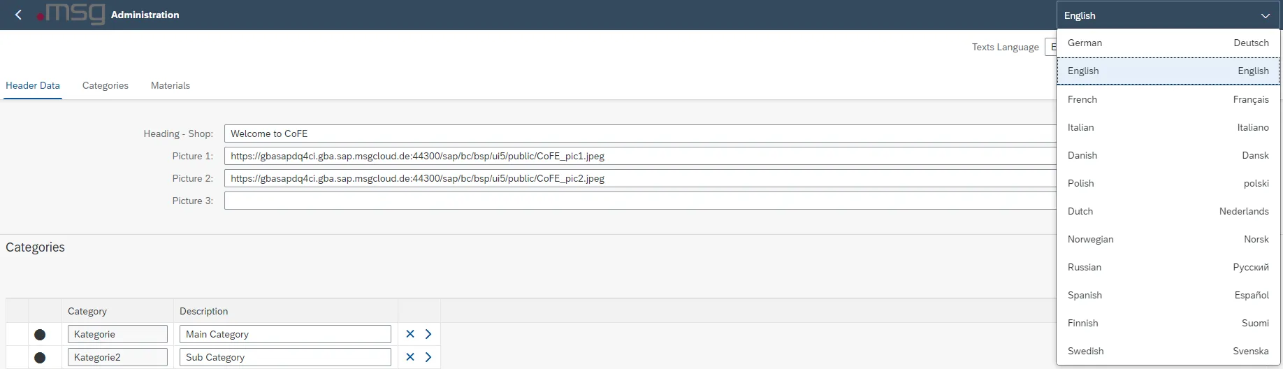
You can select the language of the user interface in the header. The application will be reloaded by changing the language and the settings that were not saved will be lost. At present, German, English, Spanish and Chinese are supported.
Language Setting Interface
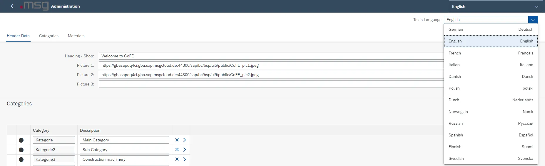
Directly underneath, you can switch between the available languages for the administration contents.
Language Setting Settings
Header Data
In the header data, you can adjust the heading on the initial screen of the shopping cart. You can maintain this individually for each language.

Adjustment field – header on initial screen
You can also set 3 picture URLs, which are displayed on the initial screen of the shopping cart. Additional information on the size of the pictures, is provided by the information button at the end of the lines.
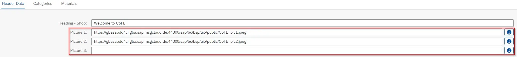
Picture Maintenance URLs for Initial Screen
Please note the size of the pictures.
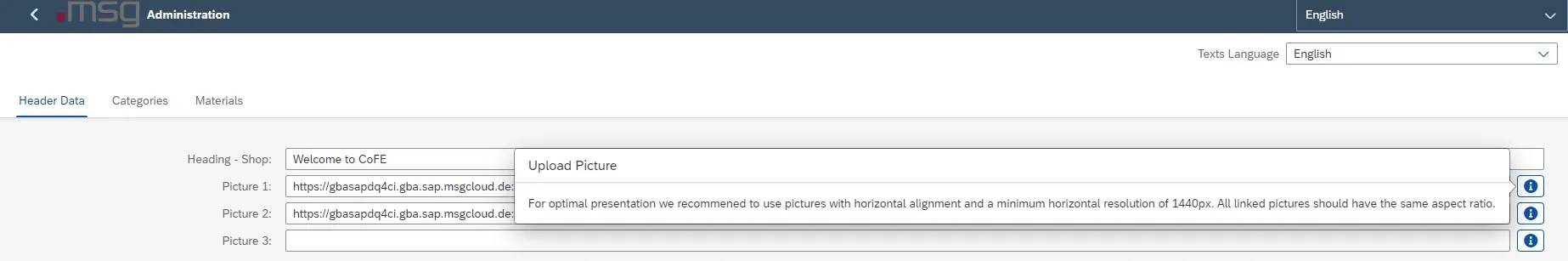
Picture URL Information Picture Size
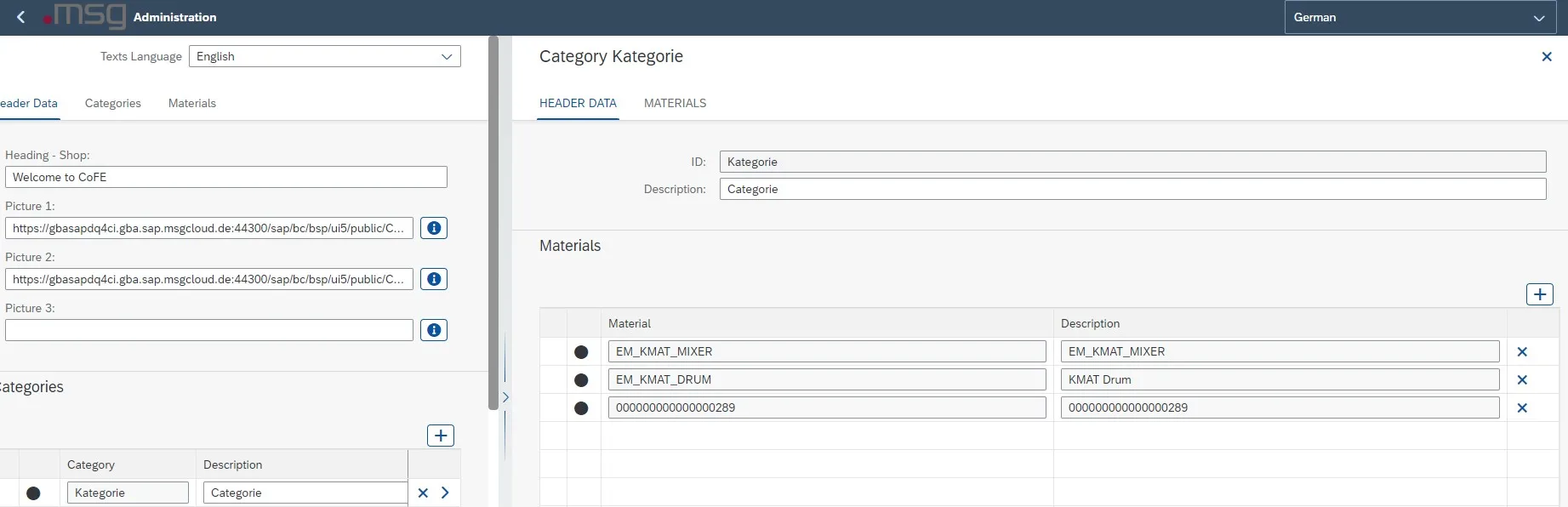
Categories Maintenance
You can assign all numbers of configurable materials to categories that are displayed on the initial screen. To create a category, you must click on the button  . You must assign a name for the category and a description.

Creation of Category
To add materials to a created category, you must navigate to the category. You do this using button  at the end of the line of categories. When you click on the
  button, a pop-up window is displayed in which all material numbers are displayed, which are not assigned. Click on the material numbers to add them to the category.
You can assign a material number to one category only.
Maintenance Material Numbers for Categories
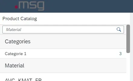
Display Category on the Initial Screen
This section is hidden on the initial screen when no categories are maintained.
Materials
In the global administration, you can maintain additional information, picture URLs, priority and text variant of the individual products.
| Column | Description | Presentation |
|---|---|---|
| Material | Material | Only used for information/display |
| Description | Material description | Only used for information/display |
| Info | This column is used to provide additional information on a product |
Maintenance information text for material
Display Information Text for Material |
| Picture | Picture of the product |
Maintenance picture URL for material
Display Picture for Material We recommend using a ratio of 1:1
You can use a compressing tool for URLs. |
| Priority | Defines the order of “Recommended products” on the initial screen |
Maintenance Priority of Materials |
| Text variant | Display variant of products and product description |
Maintenance Text Variant of Material Value:
Display Text Variant of Material “Value” Value (Description):
Display Text Variant of Material “Value” Description:
Display Text Variant of Material “Description” Description (Value):
Display Text Variant of Material “Description (Value)” |
| Navigation in material administration | Direct access to material administration of the respective material |  |
| Search field | You can filter by material and description in the search field |
Display Search in Materials You can also activate a search in the individual columns. You activate the search by clicking on the header. A pop-up window is displayed in which you can “Sort Ascending” and “Sort Descending”, or you can enter a term in the filter field.
Display Search in Materials |


![C:\Users\rthye\AppData\Local\Microsoft\Windows\Temporary Internet Files\Content.IE5\FRUFPAW1\MC900432617[1].png](./media/image5.png) The maximum length of the URL of 200 characters must not be exceeded, otherwise the picture cannot be displayed. If this is not possible, the URL must be artificially shortened.
The maximum length of the URL of 200 characters must not be exceeded, otherwise the picture cannot be displayed. If this is not possible, the URL must be artificially shortened.


Detailed Description Detail Maintenance for Materials
Material Administration
Material administration is divided into three sections. These are “Header Data”, “Groups” and “Characteristics”.
You can select the language of the user interface in the header. The application will be reloaded by changing the language and the settings that were not saved will be lost.

msg.Variant CoFE – Language Interface
Directly underneath, you can switch between the available languages of the configuration model. The description of the characteristics and characteristic values, long texts and groups of the interface design are language dependent.

msg.Variant CoFE – Language Descriptions
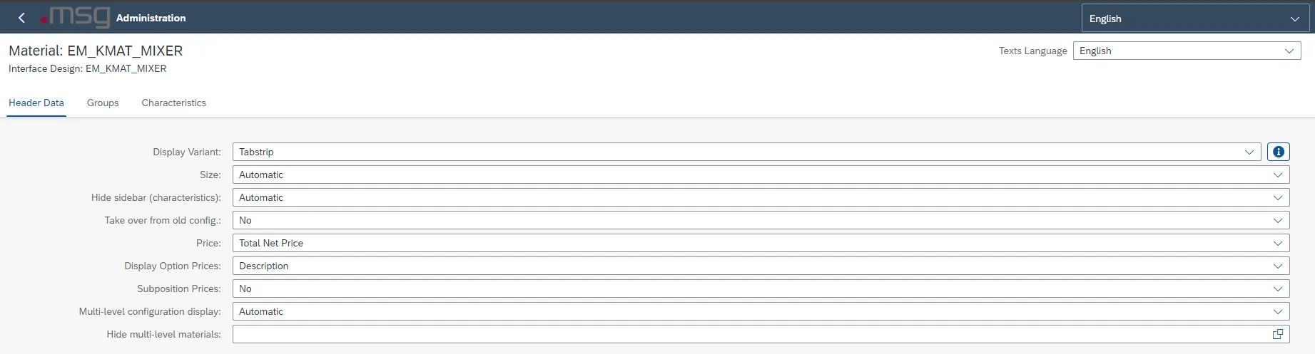
Header Data
You can make the settings for the configurable material layout in the header data.
msg.Variant CoFE – Header Data
In the header data, the following items are defined: Display variant, size, sidebar to be used, scope and display of the price and settings for multi-level configuration.
When you select “Automatic” for all options, the preset value of the system is set.
| Header data | Description |
|---|---|
| Display variant |
Setting the Display Variant – Information Icon |
| Size |
|
| Hide sidebar (characteristics) |
Msg.Variant CoFE – Configuration with Sidebar |
| Taken over from old config. |
msg.Variant CoFE – Creation of a New Configuration (Pop-Up)
|
| Price |
|
| Display of option prices |
|
| Subitem prices |
|
| Multi-level configuration behavior |
msg.Variant CoFE – Multi-Level Config. (Sidebar)
msg.Variant CoFE – Multi-Level Config. (Tabstrip)
|
| Hide multi-level materials |
|
| Display only sales relevant materials |
|
 .
.


msg.Variant CoFE – Configure Header Data
Display Variant of the User Interface
The following table shows all possible display variants with a detailed description.
| Display variants | Description |
|---|---|
| Tabstrip | The “Tabstrips” layout displays the individual groups with tabs in the first line. This enables you to switch to the respective group.
Display Variant – Tabstrip |
| Wizard | The wizard guides you through the configuration. The configuration is done group by group. When you want to switch to the next group, you can use a button to go to the next step.
Display Variant – Wizard |
| Column Page Layout | “Column Page Layout” displays the configuration in columns. The first column displays the characteristics that you can valuate by clicking. The valuation of the characteristic values is done in the second column. When you select a value, the system navigates you directly to the next characteristic.
Display Variant – Column Page Layout
Note: With this display variant, the setting of the display variant of the groups has no effect! |
| Object Page Layout | The layout is very similar to the “Tabstrips” layout and can be controlled using the tab pages in the top line. The difference is that you get all the characteristics listed on one page. You can display each section by scrolling.
Display Variant – Object Page Layout |


msg.Variant CoFE – Configuration display variant of the user interface
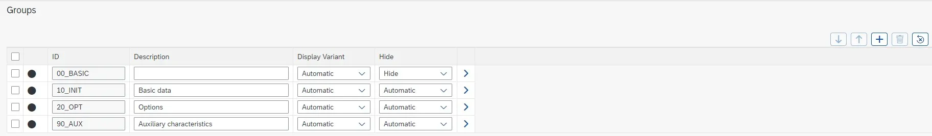
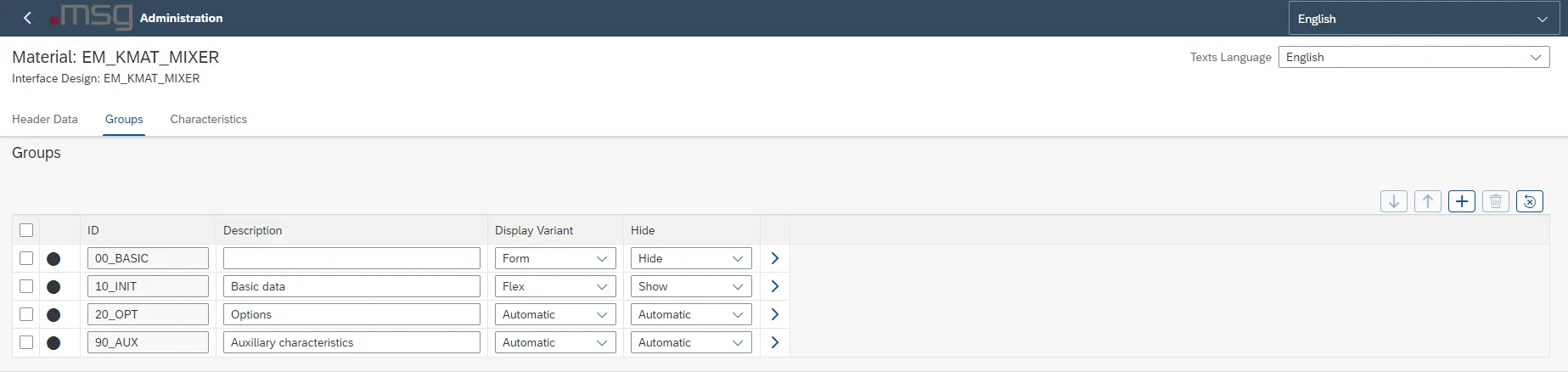
Groups
The next section contains the groups from the configurable material user interface. You can reset groups here  , add a new group
  or delete a group
  .
.
You cannot change the group ID, but you can change the description and the information text of the group. By changing the language in the header, the description and the information text can be maintained in different languages.
Msg.Variant CoFE – Groups
The order of the groups can be changed using drag & drop or using the buttons  .
.
msg.Variant CoFE – Change Order Using drag & drop
By selecting the display variant, you determine the display of the characteristics. The following options are available to you:
| Display variant | Description |
|---|---|
| Flex | In the “Flex” display variant, the characteristic names are displayed one below the other.
Group Display Variant – Flex |
| Form | In the “Form” display variant, the characteristics are also displayed one below the other. However, the characteristic name is set to the same level as the selection of the characteristic value. Group display variant – Form |
| Table | In the “Table” display variant, the characteristics and their values are displayed in a table.
Group display variant – Table |


msg.Variant CoFE – Group Display Variant
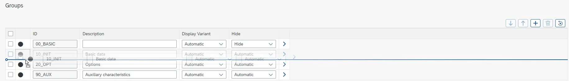
In addition, you can hide the groups so that they cannot be evaluated in the configuration and are not visible to the user. For this purpose, you can set the desired values in the drop-down menu at the end of the line of the respective group.
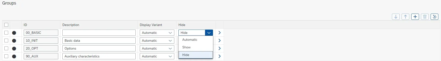
msg.Variant CoFE – Drop-Down “Hide” Groups
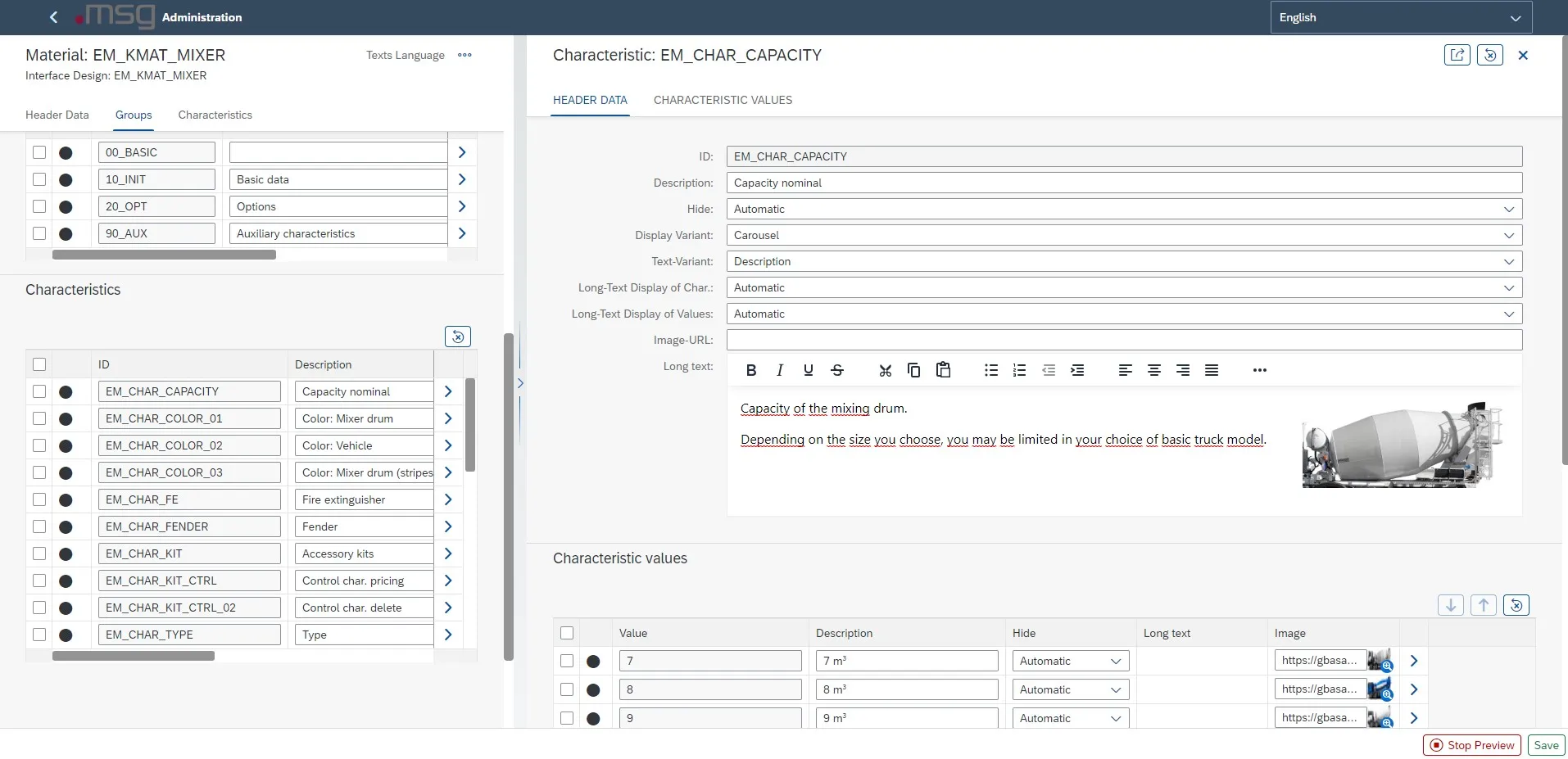
The arrow  at the end of the line is for assigning characteristics to the respective group.
Group Assignment – Header Data
All settings made at group level are available at header level and can be changed there. The size of the window can be adjusted by using the arrow in the center of the screen.
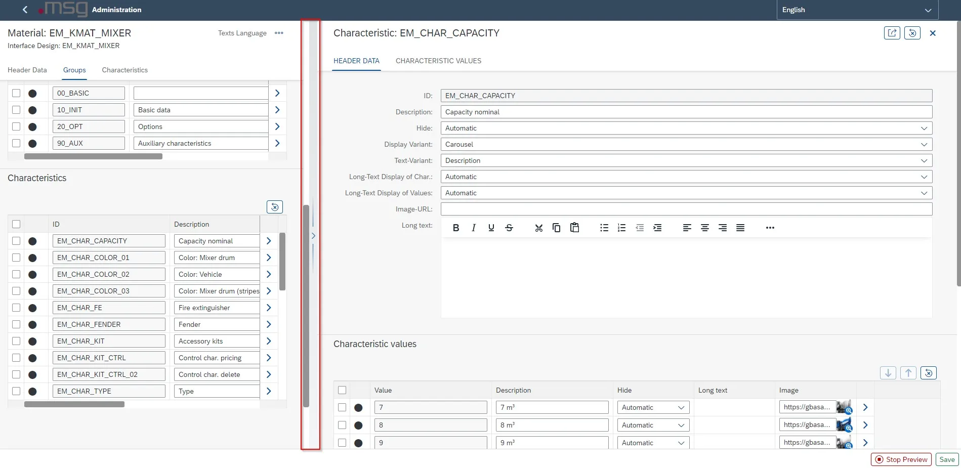
msg.Variant CoFE – Group Assignment (Header Data)
You can also add a picture to the group. You can use the long text to add text to a group or attach a document. Detailed information about using a long text in connection with the layout display is given in chapter Combination of Display Forms.
The lower section shows all characteristics that can be assigned to groups. The characteristics are sorted in the displayed order. You can change the sort order by using drag & drop.
You can define how the characteristics are to be displayed using the display variant and the text variant. The different display and text variants are described in detail in tables 7–9.
You can open the maintenance of the assigned characteristics in the lower section. The maintenance of characteristics is described in the next chapter.
| Header data group | Description |
|---|---|
| ID | Group name |
| Description | Description of the characteristic, language-dependent |
| Hide |
|
| Display variant | You can adjust the group display:
|
| Long text display of characteristics |
|
| Collection group |
|
| Image URL | The linked image is integrated into the header of the characteristic. This is not possible with all display variants.
You can use a compressing tool for URLs. |
| Long text | You can add a long text of the characteristic group using this free text field. |
msg.Variant CoFE Description Header Data
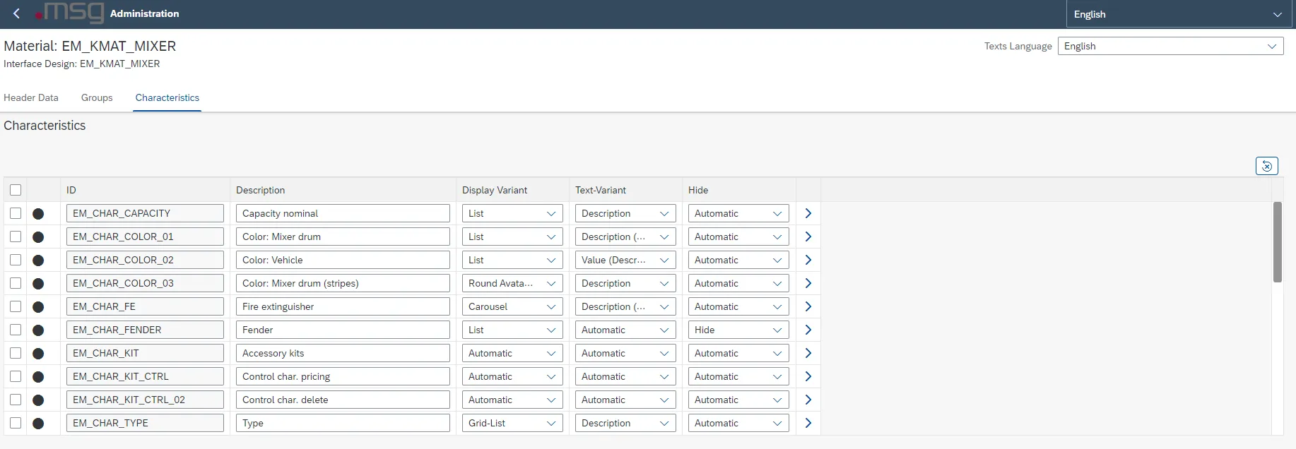
Characteristics and Assigned Characteristics
The last section lists all characteristics that are assigned to the material. All settings, which can be done for the characteristics within the group, can also be made in this area.
For characteristics, you can
-
change the description of the characteristic,
-
add an info text,
-
determine the text variant and
-
decide if the characteristic is to be hidden.
The different display variants are described in detailed in the following table:
| Display variant | Description |
|---|---|
| Input Field |
Display Variant – Input Field (1/2)
Note: With this display variant, the system does not display any images at the characteristic values. |
| Select Dropdown |
Display Variant – Select Dropdown |
| List |
Display Variant – List |
| Grid List | This is a two-dimensional list view, which aligns the cells in a grid-based layout
Display Variant – Grid-List |
| Date Picker | You can select a date by using the “Calendar” icon:
Note: The characteristic for this display variant must have the format ‘DATE’! |
| Switch |
Display Variant – Switch |
| Avatar List | This is a two-dimensional list view in which a picture is displayed in a round frame above the value
Display Variant – Avatar |
| Carousel |
Display Variant – Carousel |
| Segmented Button |
Display Variant – Segmented Button |
| Radio Button Group | This is a graphic control element that enables the user to only select one of several pre-defined options, which mutually exclude each other. The unique property of an option field differentiates it from checkboxes in which the user can select and de-select any number of elements.
Display Variant – Radio Button Group |
| Step Input | Here you can gradually change the value of an integer numerical characteristic:
Display variant – Step Input |


msg.Variant CoFE – Display Variants – Characteristics
For characteristic values with multiple selection of the values, you can select the following display variants:
| Display variants | Description |
|---|---|
| Multi Combo Box |
Display Variant – Multi Combo Box |
| Multi Input |
Display Variant – Multi Input (1/2)
Display Variant – Multi Input (2/2) |
| Multi List | Multiple selection using a list with checkboxes
Display Variant – Multi List |
| Multi Grid List | Multiple selection using a list with checkboxes:
Display Variant – Multi Grid List |


msg.Variant CoFE – Display Variants Characteristics (Multi-Selection)
In addition to the display variants, you can select how characteristic values are to be displayed in the configuration. You can select the following text variants:
| Text variant | Description |
|---|---|
| Value | Display of technical characteristic values
Text Variant – Key |
| Value (description) | Display of technical characteristic values with the respective text description in brackets
Text Variant – Key (Text) |
| Description | Display of the respective text description of characteristic values
Text Variant – Text |
| Description (value) | Display of the respective text description and the technical characteristic value in brackets
Text Variant – Text (Key) |


msg.Variant CoFE – Text variant
The selection of a text variant does not work with the following display variants:
- Input Field
-
Date Picker
-
Checkbox (checkbox)
-
Switch
-
Step Input
Characteristic – Header Data
The arrow at the end of the line takes the user to the header data of the characteristic. Next to the data, which can also be maintained in the previous step, a
-
a picture can be added to the characteristic via a URL and
-
a long text can be defined (Please note: The different display options (see Combination of Display Forms) of a long text depend on the display variant of the group and the characteristic).
Characteristic – Header Data
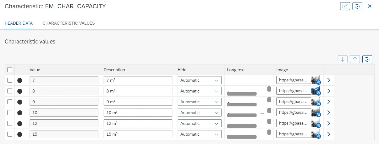
You can edit the characteristic values in the lower section. Similar to characteristics,
-
you can change the sort order by using drag & drop and
-
select the characteristic values as “hidden”.
| Header data characteristics | Description |
|---|---|
| ID | Characteristic name |
| Description | Description of the characteristic, language-dependent |
| Hide |
|
| Display variant | The display of the characteristic can be adjusted, the exact explanation of the different display variants can be taken from the tables in Chapter Display of the Long Text of a Characteristic. |
| Text variant | You can use this to determine for each characteristic whether the value, its description of both is to be displayed. The table in chapter Display of the Long Text of a Characteristic Value contains an exact explanation. |
| Long text display of characteristics |
|
| Long text display of values |
|
| Image URL | The linked image is integrated into the header of the characteristic. Not possible with all display variants
You can use a compressing tool for URLs. |
| Long text | You can add a long text of the characteristic using this free text field. Display Long Text for Characteristic |

msg.Variant CoFE – Description Header Data Characteristics
Characteristic Values – Specification
The arrow at the end of the line takes the user to the specification of the characteristic value. Here you can
-
Add a picture to the characteristic via a URL and
-
Define a long text (Please note: The different display options (see Combination of Display Forms) of a long text depend on the display variant of the group and the characteristic).
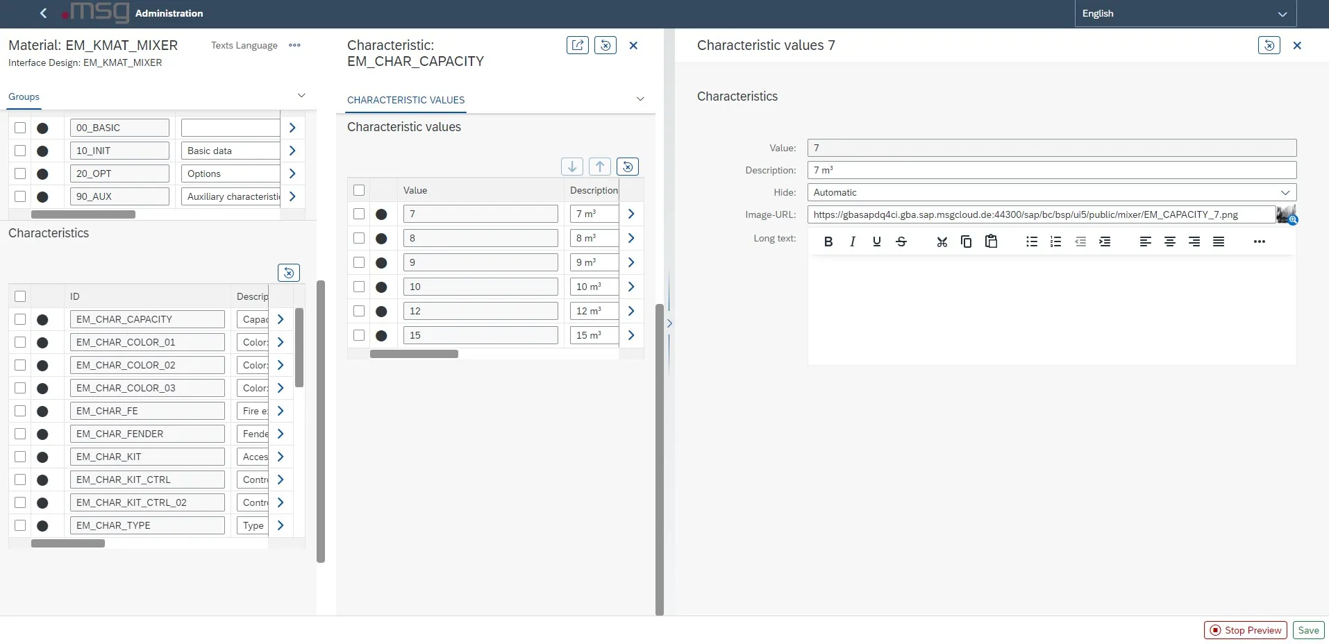
Characteristic Value – Specification
Combination of Display Forms
The field “Long text” can only be displayed in different combinations. The following tables show the possible combinations for displaying the long text of characteristics or characteristic values.
Display of the Long Text of a Characteristic
Direct integration of the long texts at the characteristic is only possible in the display variant flex.
|
|
|
|
|
|
|
|
|
|
|
|
|
|
|---|---|---|---|---|---|---|---|---|---|---|---|---|---|
| Flex | X | X | X | X | X | X | X | X | X | X | X | X | X |
| Form | |||||||||||||
| Table |
Long Text Included in Characteristic
You use the info button to enable integration in the following constellations:
|
|
|
|
|
|
|
|
|
|
|
|
|
|
|---|---|---|---|---|---|---|---|---|---|---|---|---|---|
| Flex |  |
|
|
|
|||||||||
| Form | |
|
|
|
|
||||||||
| Table | |
|
|
|
Long Text at the Characteristic Using the Information Button
Display of the Long Text of a Characteristic Value
|
|
|
|
|
|
|
|
|
|
|
|
|
|
|---|---|---|---|---|---|---|---|---|---|---|---|---|---|
| Flex | X | X | X | X | |||||||||
| Form | X | X | X | X | |||||||||
| Table |
Long text – Display Characteristic Value
You can use the  button to display the long text at the value in all combinations.
Up-/Download Function
With the Up-/Download Function, all settings and enriched data of the KMAT can be downloaded and uploaded. This function makes it easier to adjust data form the same or similar KMATS.
![C:\Users\rthye\AppData\Local\Microsoft\Windows\Temporary Internet Files\Content.IE5\FRUFPAW1\MC900432617[1].png](/_astro/image5.BY_NdaeD_2raMmQ.webp) Before using this function to its full extent, you should make a backup copy of the settings beforehand, e.g. download all settings together as JSON.
Before using this function to its full extent, you should make a backup copy of the settings beforehand, e.g. download all settings together as JSON.
The Up-/Download Function should also only be used by experienced users, as these settings are irrevocably overwritten!
Download Function
Clicking on the button  in the footer bar of the material administration opens a pop-up window in which you can select which data is to be downloaded.
In this pop-up window, you can choose between an Excel download (separate) and JSON (complete) download.
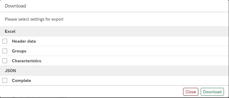
When the flag is set in the “Download JSON” section, all material administration data is downloaded in the form of a JSON file.
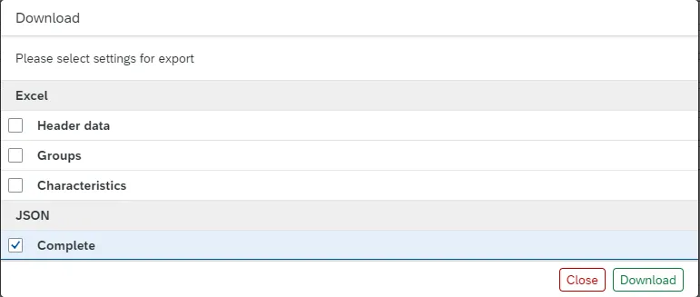
When you set the flag at “Header data”, “Groups” or “Characteristics”, the selected KMAT data is downloaded in the form of an Excel file that can be edited in Excel after the download.
The following data is available for download:
- Header data of the KMAT
- Groups with header data and characteristic assignment
- Characteristics
- Characteristics values
Upload Function
Clicking on the button  in the footer bar of the material administration opens a pop-up window in which you can select which data is to be uploaded.
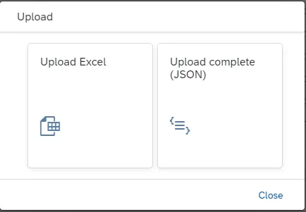
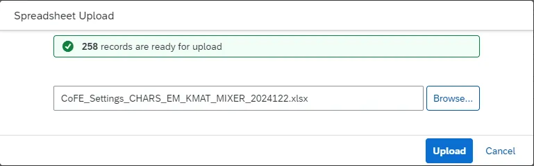
When you select the button “Upload Excel”, the desired Excel file must be selected in the file browser. After selecting the file, the number of data records available for upload is displayed.
The file is uploaded by clicking the button 
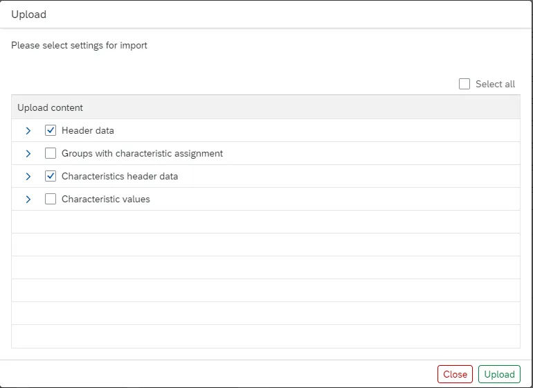
When you select the button “Upload complete (JSON)”, you must select the desired JSON file in the file browser. After selecting the file, you can select which data records are to be uploaded.
After selecting the desired data, the data is uploaded by pressing the button  .
.
Language code
Language-dependent elements use the 1-digit SAP language key in the download files. The assignment is as follows:
| Description Language | Language code (SAP) | Language code to be used |
|---|---|---|
| Serbian | SR | 0 |
| Chinese | ZH | 1 |
| Thai | TH | 2 |
| Korean | KO | 3 |
| Romanian | RO | 4 |
| Slovenian | SL | 5 |
| Croatian | HR | 6 |
| Malay | MS | 7 |
| Ukrainian | UK | 8 |
| Estonian | ET | 9 |
| Arabic | AR | A |
| Hebrew | HE | B |
| Czech | CS | C |
| German | DE | D |
| English | EN | E |
| French | FR | F |
| Greek | EL | G |
| Hungarian | HU | H |
| Italian | IT | I |
| Japanese | JA | J |
| Danish | DA | K |
| Polish | PL | L |
| Chinese don. | ZF | M |
| Dutch | NL | N |
| Norwegian | NO | O |
| Portuguese | PT | P |
| Slovak | SK | Q |
| Russian | RU | R |
| Spanish | ES | S |
| Turkish | TR | T |
| Finnish | FI | U |
| Swedish | SV | V |
| Bulgarian | BG | W |
| Lithuanian | LT | X |
| Latvian | LV | Y |
| Customer reserve | Z1 | Z |
| Afrikaans | AF | a |
| Icelandic | IS | b |
| Catalan | CA | c |
| Serbian (Latin) | SH | d |
| Indonesian | ID | i |
| Hindi | HI | 묩 |
| Kazakh | KK | 뱋 |
| Vietnamese | VI | 쁩 |